“A brand is a person’s gut feeling about a product, service, or organization. It’s not what you say it is. It’s what they say it is.” – Marty Neumeier.
A brand is defined by the community it has around it, and a logo design plays a significant role in shaping the community’s perception. It is often the first interaction a potential customer has with your business.
In fact, 75% of consumers judge a brand’s credibility based on its logo. And sadly, 60% of consumers avoid companies with unappealing logos, seeing them as untrustworthy. That means a logo has enough power to make or break how your brand is perceived. In other words, if your logo is weak, looks bad, or fails to impress the audience, you will lose trust before you even get a chance to prove your value.
You would be surprised knowing how many companies, despite investing a fortune in their logos, ended up creating a disaster logo that served them nothing good; on top of that, they ended up being listed among ‘logo fails of all time’.
The logo fails for multiple reasons. Those mistakes not only cause a significant capital loss but also impact the reputation of a company. But what are those errors?
Let’s look at the common mistakes to avoid, along with some bad company logos where designing and rebranding a logo went wrong.
Oftentimes, companies make bad design choices. The logo, which is supposed to speak to your company’s values, sends the wrong message. Cherry on top, those companies don’t even realize that their logo is working against them. Understanding the critical role of professional logo design can mean the difference between a forgettable mark and a truly iconic brand.
There’s no denying the fact that modern logos usually lean toward minimalism. However, it should never be so stripped down that it loses its uniqueness or ability to communicate visually.
Plenty of companies nail the simplicity but forget the character. The result? A logo that’s forgettable and lacks the visual hook that sets it apart.
The logo design services never compromise on the design just to come up with a minimal contemporary logo. They understand and always keep the balance between concept and design. They do their utmost to come up with a company logo, which is neither too basic nor overly complex, just a thoughtful, well-balanced concept.
There is a saying within the logo design industry:
“Perfection is achieved, not when there is nothing more to add, but when there is nothing left to take away.”
Drawing inspiration from iconic logos like Apple or Nike? Fine, it’s natural. But taking it too far? That’s where the problem begins. When your logo looks like a carbon copy of other brands, it loses its identity and credibility.
While it’s common to be influenced by successful logo designs, copying crucial elements of logo design crosses into plagiarism. When that happens, your brand comes across as unoriginal and untrustworthy.
Sometimes, it happens unintentionally. Designers sometimes have those “lightbulb” moments only to discover later that their amazing idea already exists somewhere. It’s not always deliberate, but it highlights why thorough research is important. Know your design history. Understand your competitors. Stay aware of what’s already out there so you can create something unique.
Trends are tempting. They make things attractive, but just for a small period of time. One moment, your logo looks cutting-edge. The next? It’s outdated, and the logo fails.
Yes, the logo design industry is flooded with trendy designs popping up every few months. But remember: your logo isn’t supposed to be a seasonal fashion statement. It is supposed to be timeless and memorable.
A great logo can last for decades with minimal changes. So before jumping on the latest design trends, ask yourself:
Will this still represent my brand five or ten years from now?
If the answer is “probably not,” it’s time to redesign.
Sure, simplicity has its pitfalls, but overloading a logo with elements is just as risky. Overstuffing multiple elements in your logo design confuses the audience. When a design tries to say too much, it ends up saying nothing at all.
Take the logo as your visual elevator pitch. It should quickly communicate “who you are” and “what you offer”—without requiring your audience to squint, read taglines, or decode symbols. If your logo includes too many elements or messages, it dilutes the impact. Therefore, your logo must be concise and clear, along with the message it delivers to your target audience.
A strong logo focuses on one clear idea. So, be careful with your design choices. Instead of overstuffing taglines and other elements, stick with one and create a proportionate and legible design that says a lot with fewer details.
No matter how beautiful your logo is, if it fails to define your brand, it makes no sense.
The logo should feel aligned with your company’s values, purpose, and audience right from the start. That’s why understanding clients’ needs has become one of the crucial parts of the custom logo design process. You need to have a better understanding of the target audience and the nature of the company. Without that foundation, you risk creating a design that might completely miss the mark in branding.
If your logo is too generic, it won’t stand out. And if it doesn’t tell your brand’s story or reflect your mission, it loses its purpose. The entire point of a logo is to serve as a visual anchor—something that instantly says this is who we are.
Over the years, we have seen some of the bad logos that left people confused, amused, or horrified. Let’s understand the above-mentioned mistakes through real-life examples.
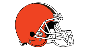
The Cleveland Browns, an American Football team, took the minimalist route way too far. Their logo is just a plain orange football helmet, which is too generic, like it belongs to any high school team.
What’s missing? Personality, uniqueness, and that spark of identity that fans can rally around.

Pathmark’s logo isn’t exactly offensive; it’s just incredibly forgettable. For a major grocery store, their bland typeface and zero creative elements fail to spark any emotional or visual connection. It’s the logo equivalent of white bread.
What could be better? A visual identity that reflects freshness, convenience, and community.
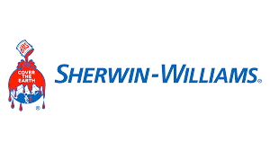
Sherwin-Williams is known for its reliable, high-quality paint products. But despite its success, it has long been criticized for a logo that, to many, looks more like a dystopian horror poster than a corporate emblem. It would not be wrong if we put its logo in the “worst company logos of all time.”
The company’s “Cover the Earth” logo gets an earful of criticism. The logo featured a blood red paint dumping over the planet. It was meant to signify global reach and market dominance. In an era of environmental awareness, the image of Earth covered with blood red paint sends a far more troubling message.
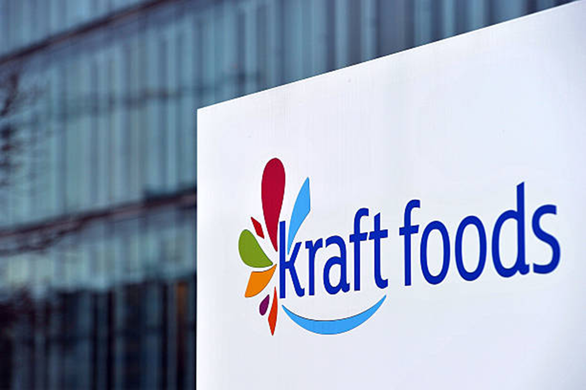
When Kraft debuted their vibrant, swirling logo, it felt more like a carnival brand than a trusted food company. While it was bright and dynamic, it was also chaotic and overly playful, which compromised the brand’s credibility.
What fell flat: The circus-like design clashed with Kraft’s image as a household staple.

Animal Planet’s original logo had an elephant—relevant, iconic, and emotionally resonant. After rebranding a sideways “M” with no visual connection to animals or nature. It’s abstract to the point of confusion.
The disconnect: Viewers can’t tell what the brand is about at a glance.

CareerBuilder’s logo redesign felt like it was trying to do too much. It was a branding mess with different colors, conflicting fonts, and overlapping shapes. Instead of streamlining their identity, the logo became a distraction.
The result: Viewers can’t quickly grasp what the company offers.
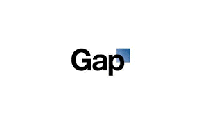
Gap is a well-known, well-established American clothing company with its highly recognizable logo, which represented the brand from 1990 to 2010. The logo was a simple dark blue square featuring the ‘Gap’ name in white serif writing.
In 2010, the brand underwent a visual rebranding following a significant change in the company’s strategy. Therefore, the old Gap logo was replaced with a new logo that featured a much smaller dark blue box and the ‘Gap’ name written in bold, black Helvetica font.
When Gap unveiled its new logo in 2010, the reaction was swift and overwhelmingly negative. The logo redesign was widely regarded as a branding misstep, primarily due to its poor execution and failure to consider consumer sentiment.
The rebranding was introduced without any lead-up or accompanying organizational changes, which left both consumers and branding professionals confused and frustrated. Social media erupted with criticism, and parody sites mocking the redesign went viral. While a few praised the new look for reflecting Gap’s plain and practical nature, the vast majority rejected it.
The backlash forced the company to revert to its original logo within days. This highlights the importance of strategic communication and consumer trust in any branding effort.
Logo fails are not just embarrassing; they can have massive consequences for your brand’s perception and performance. Avoid the fate of the worst company logos by approaching design with clarity, strategy, and expertise.
Work with logo design companies that understand the power of visual branding. Most importantly, don’t rush it. A great logo takes time, research, and collaboration. Let your logo be the face you’re proud to show the world. Because in branding, you rarely get a second chance to make a first impression.
Looking for more information? Call us at +1 (855) 521-5040 for quick support!


Have a project in mind? Reach out to us, and we’ll help turn your ideas into stunning illustrations.
Tell us what you need, and we’ll create a custom illustration just for you. Reach out today and let's get started!

Copyright © 2026 360 Illustration House | All rights reserved. Terms And Conditions | Privacy Policy | Refund Policy
